The Biggest Website Mistakes Therapy Practices Make
Most therapy websites are quietly costing practices thousands in lost bookings every month. Here are the most common mistakes — and exactly how to fix them.
The Biggest Website Mistakes Therapy Practices Make:
Your therapy website is either your best salesperson or your biggest liability. For most practices it is the latter — and the therapist has no idea.
Patients are landing on your site, looking around for a few seconds, and leaving without booking. Not because they did not need therapy. Not because you were not the right fit. Because something on the page lost them before they ever got the chance to find out.
Here are the biggest mistakes therapy websites make — and what to do about each one.
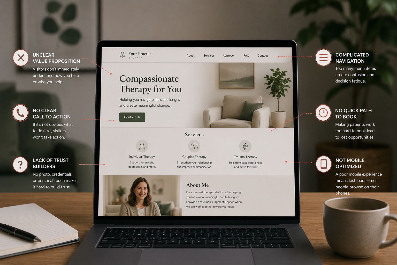
Mistake #1: No Clear Headline
The first thing a patient reads when they land on your homepage determines whether they stay or leave. Most therapy websites open with something vague like "Welcome" or "A place for healing and growth."
That tells the patient nothing. Who do you help? What problem do you solve? Why should they keep reading?
A homepage headline that converts is specific. It names the person and the problem in plain language. If someone lands on your page and cannot tell within five seconds who you help and what you do — they are already gone.
Mistake #2: Burying the Booking Button
If a patient has to scroll to find out how to book an appointment with you — you are losing them.
The booking button needs to be visible the moment someone lands on your page. Above the fold. Before they scroll. One clear button that goes directly to your scheduler with zero extra steps in between.
Most therapy websites have a contact form buried at the bottom of the page or a phone number to call during business hours. Neither of those is a booking flow. Both of them cost bookings every single day.
Mistake #3: Writing for Colleagues Instead of Patients
Therapists are trained in clinical language. That language belongs in case notes — not on a homepage.
When your website talks about "evidence-based modalities," "somatic approaches," and "attachment-informed care" — your patients are not following along. They are not therapists. They do not know what those terms mean. And more importantly, those terms do not speak to what they are actually feeling.
Write your website the way your patients talk about their own problems. "Anxiety that won't quiet down." "A relationship that feels stuck." "Burnout that a vacation didn't fix." That language makes patients feel seen. Clinical language makes them feel confused.
Mistake #4: Using Stock Photos
A photo of an empty couch. Two hands holding a coffee cup. A generic sunset. These images are on thousands of therapy websites and they communicate one thing: this practice does not feel real.
Therapy is one of the most personal decisions a person makes. They want to see the actual human they will be working with — not a staged photo that could belong to any practice in the country.
A real photo of you — warm, approachable, taken on a decent phone in good light — does more for your conversion rate than any stock image library.
Mistake #5: Slow Load Times
More than seventy percent of therapy website visits happen on a mobile phone. If your site takes more than three seconds to load — a significant percentage of those visitors leave before they see a single word.
Page speed is not a technical nicety. It is a conversion issue. A slow website is an empty calendar waiting to happen.
Most therapists have no idea how fast or slow their site loads. You can check yours for free at pagespeed.web.dev. If your mobile score is below seventy — your site is losing you patients before they even arrive.
Mistake #6: No Social Proof
Patients choosing a therapist are making a deeply personal decision about who to trust. They want evidence that other people took this step and it was worth it.
If your website has no reviews, no testimonials, no indication that real patients have worked with you and had a positive experience — you are asking visitors to take a leap of faith that most of them will not take.
A few anonymized patient testimonials. Your Google rating. Logos from Psychology Today or Zocdoc. These small additions to your homepage build the trust that turns a visitor into a booked patient.
Mistake #7: Multiple Competing Calls to Action
Email me. Call this number. Fill out this form. Book here. Follow me on Instagram.
Every option you give a patient is a decision they have to make. And people in distress do not want to make decisions — they want to be guided.
When a patient lands on your page and sees five different ways to contact you, they often choose none of them. Pick one primary call to action — online booking — and make every element of your page point toward it.
Mistake #8: No Mobile Optimization
If your website was designed on a desktop and never properly tested on a phone — it is almost certainly broken for the majority of your visitors.
Text that is too small to read. Buttons that are too close together to tap accurately. Images that do not resize correctly. A booking flow that breaks halfway through on a small screen.
Open your website on your phone right now. Try to book an appointment as if you were a new patient. If anything feels frustrating or unclear — your patients feel that too. And most of them do not push through it.
Mistake #9: No Blog or Content
A website with no content is a website with one door. Your homepage. That is the only way Google can send someone to you.
Every blog post you publish is a new door. An article targeting "how to know if you need therapy" can rank for that search and bring in patients who are already considering getting help. An article on "what to expect from your first therapy session" can rank for that search and bring in patients ready to book.
Practices with no content are competing for the same generic keywords as every other therapist in their city. Practices publishing consistent content are building a library of doors that bring in patients around the clock.
Mistake #10: Not Updating the Site
A website that was built two years ago and never touched since sends a signal — to Google and to patients — that the practice is not active.
Outdated hours. An old photo. A blog that was started with two posts and abandoned. Services that are no longer offered. Insurances listed that you no longer accept.
Google rewards websites that are regularly updated with fresh content. Patients trust practices whose online presence looks current and alive. A neglected website is not neutral — it is actively working against you.
The Bottom Line
Your therapy website should be your hardest working team member — bringing in patients, building trust, and booking appointments around the clock without any effort from you. If it is not doing that, it is not a design problem. It is a strategy problem.
Practado builds and manages conversion-focused websites exclusively for mental health and telehealth practices. Every site is engineered to fix every mistake on this list — and to keep working month after month without you having to think about it. Book a free strategy call or visit practado.com/book to see what's included.