What Therapists Should Put on Their Homepage to Increase Bookings
Most therapy homepages are losing patients before they ever read past the first line. Here's exactly what your homepage needs — and in what order — to turn visitors into booked appointments.
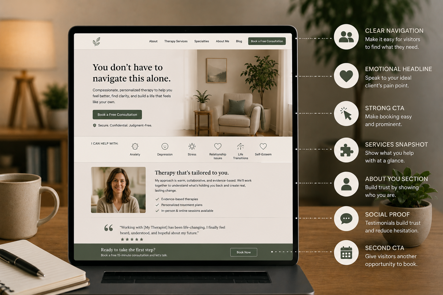
What Therapists Should Put on Their Homepage to Increase Bookings:
Your homepage has one job.
Not to impress colleagues. Not to list every modality you're trained in. Not to tell your full story or explain your theoretical orientation.
Its one job is to take someone who lands on it and walk them to a booked appointment. Everything on the page should serve that goal or get out of the way.
Here is exactly what needs to be on your therapy homepage — and in what order.
1. A Headline That Speaks Directly to the Patient
The headline is the first thing a visitor reads. You have about five seconds before they decide whether to stay or leave. Most therapy homepages waste those five seconds on something like "Welcome to my practice" or "A safe space for healing."
Those headlines say nothing. They do not tell the patient who you help, what problem you solve, or why they should keep reading.
A headline that converts is specific. It names the person and the problem.
"Therapy for anxious professionals in [city] who are tired of just getting by."
"Helping couples in [city] stop having the same fight and actually move forward."
"You've been holding it together for everyone else. This is the place to put yourself first."
One sentence. Specific. Speaks directly to the patient sitting at their phone at 11pm wondering if they should finally do this.
2. A Subheadline That Explains What You Do and Where
Directly beneath your headline, one or two sentences that make it immediately clear what kind of therapy you offer, who it is for, and where you are located.
"Individual and couples therapy in Austin, TX — in-person and via telehealth. Accepting new patients."
This is not creative writing. It is clarity. And clarity converts.
3. A Single Booking Button Above the Fold
Above the fold means visible on the screen before anyone scrolls. If a patient has to scroll to find out how to book — you are losing them.
One button. Clear label. "Book a free consultation" or "Schedule your first session" or "Check availability." It goes directly to your online scheduler. No extra steps. No forms to fill out before they have even spoken to you.
This button should appear at least three times on your homepage — above the fold, in the middle of the page, and at the bottom. Every section of your homepage should give the patient an easy way to take the next step.
4. A Brief "Who I Help" Section
After your headline and booking button, give the patient a way to quickly confirm they are in the right place.
A short list or a few sentences covering the types of people you work with and the issues you specialize in. Not a clinical list of diagnoses — language that mirrors how patients actually describe their own experience.
"I work with adults who are dealing with anxiety that won't quiet down, relationships that feel stuck, and the kind of burnout that a vacation doesn't fix."
When a patient reads that and thinks "that's me" — they are already halfway to booking.
5. A Human Photo of You
Not a stock photo of a couch. Not an abstract image of a sunset. A real photo of you — warm, approachable, professional.
Therapy is one of the most personal services a person can choose. Patients are deciding whether they can trust you with their most difficult experiences. A real photo of the actual human they will be working with builds more trust in two seconds than three paragraphs of credentials.
If you do not have a professional headshot, a clean, well-lit photo taken on a phone is significantly better than no photo or a generic stock image.
6. Social Proof — Reviews and Recognizable Logos
After introducing yourself, give the patient evidence that other people have trusted you and had a good experience.
A few anonymized patient testimonials. Your Google rating and number of reviews. Logos from Psychology Today, Zocdoc, or any media you have been featured in.
Social proof is not bragging. It is reassurance. A patient on the fence about booking needs to feel that other people took this step and it was worth it. Give them that evidence early and clearly.
7. A Simple Explanation of What to Expect
One of the biggest barriers to booking a first therapy appointment is not knowing what to expect. People worry about being judged. They worry about not knowing what to say. They worry about the process itself feeling overwhelming.
A short section — three or four sentences or a simple three-step visual — that walks through what happens after they book removes that anxiety before it becomes a reason not to book.
"Book a free fifteen-minute call. We'll see if we're a good fit. If we are, we'll schedule your first session and get started."
Simple. Clear. Non-threatening.
8. A Strong Closing Call to Action
End your homepage with a direct, warm invitation to take the next step. Not a form. Not a phone number to call during business hours. A booking button that goes directly to your scheduler.
Reiterate who you help and what you offer. Remind them that taking this step is the right one. And make it as easy as possible to do it right now, while they are still on the page.
What to Remove From Your Homepage
As important as what to include is what to cut.
Your full clinical biography does not belong on the homepage — move it to an about page. A long list of every modality you are trained in overwhelms rather than converts. Multiple contact options — email, phone, form, and booking link all competing for attention — create confusion. And anything that requires a patient to think too hard about what to do next costs you a booking.
Every element on your homepage should either move the patient toward booking or be removed.
The Bottom Line
Your therapy homepage is not a brochure. It is a conversion tool. The practices filling their calendars consistently have homepages built around one goal — getting the patient from arrival to booked appointment as quickly and comfortably as possible.
If your current homepage is not doing that, it is costing you booked appointments every single day. Practado builds conversion-focused websites exclusively for mental health and telehealth practices — engineered from the ground up to turn visitors into patients. Book a free strategy call or visit practado.com/book to see what's included.